Color Psychology in Skincare Packaging: Unleash the Science Behind Beauty
Have you ever found yourself drawn to a skincare product simply because of its eye-catching packaging? Color psychology in skincare packaging is more than just aesthetic appeal; it plays a crucial role in shaping consumer perception and even how effectively we believe a product will perform. As the competition in the beauty industry intensifies, companies are leveraging color theories to create alluring packaging that not only attracts the eye but also communicates brand values and benefits. In this exploration, we delve into how various colors influence consumer behavior and perceptions in the skincare sector.
Understanding Color Psychology
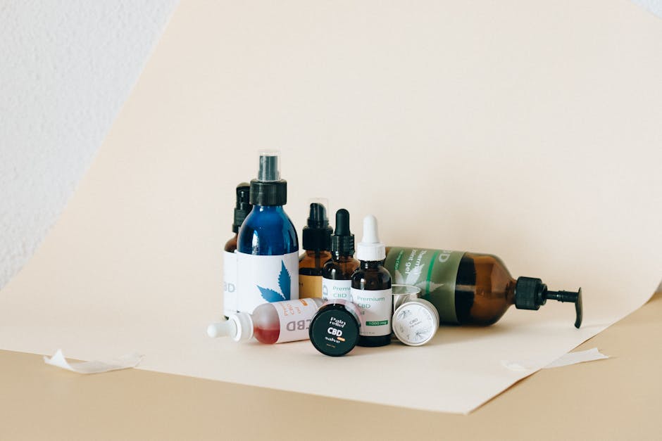
Color psychology is the study of how colors affect perceptions, emotions, and behaviors. When it comes to the beauty and skincare market, understanding which colors evoke trust, luxury, or even calmness can directly impact brand success. For instance, blue tends to be linked with trust, reliability, and tranquility, making it a popular choice for brands aimed at promoting relaxation and calmness. On the other hand, vibrant colors like red or orange might evoke feelings of excitement and energy, suitable for products aiming to energize or rejuvenate the skin.
The Emotional Connection
Emotions are strong influencers in our purchasing decisions. A skincare product packaged in calming shades of green can create an association with nature and evoke feelings of health and tranquility. Brands that harness this visual language can effectively connect with consumers on a deeper emotional level, making their products more inviting. This emotional resonance is a vital cue that guides customers—often without them even realizing it—towards making a purchase.
A great example of this is seen with eco-friendly brands that often incorporate earthy tones, greens, and browns into their packaging. This usage can elevate their brand message, subtly signaling to consumers that their products are natural, sustainable, and safe—a compelling trigger for today’s environmentally-conscious buyer.
Colors in Skincare Packaging and Their Meanings
1. Blue: Trust and Serenity
Many skincare brands use blue to suggest a sense of calm and reliability. Products designed for sensitive skin or soothing effects often lean towards blue hues. This color communicates trustworthiness—which is vital for a market that requires the consumer to feel safe in trying something new on their skin.
Moreover, research has shown that blue can enhance the perception of efficiency in performance. If a product claims to hydrate or soothe, packaging with blue might subconsciously enhance consumers' beliefs in its efficacy.
2. Green: Nature and Health
Green symbolizes health, wellness, and nature. It's an ideal choice for organic or natural skincare brands aiming to portray their integrity. Packaging that incorporates shades of green can evoke the purity and freshness associated with natural ingredients, making it an attractive choice for those seeking products free from artificial additives.
The appeal to natural beauty often drives consumers to brands using green as a primary color. Products adorned with such colors can resonate well with consumers seeking a healthier, more environmentally-friendly option.
3. Pink: Femininity and Softness
When it comes to feminine beauty, pink reigns supreme. It's often associated with softness, love, and compassion. Many skincare products targeted at women utilize pink shades to evoke a sense of approachability and friendliness.
That said, brands need to tread carefully; the various shades of pink can carry different meanings. A soft pastel may convey gentleness, while a bright fuchsia can suggest vibrancy and energy. The choice of hue matters in shaping consumer expectations.
4. Black: Luxury and Sophistication
There's no denying the allure of black packaging in the beauty industry. Black packs a punch, exuding luxury, elegance, and sophistication. Brands seeking to position themselves in the high-end market often lean towards sleek black designs to suggest premium quality.
Contrary to other colors, black doesn’t overwhelm; instead, it creates a canvas against which other elements—like textures or logos—can exude distinctiveness. This makes it a powerful choice for luxury skincare brands that want to stand out but remain subtly understated.
5. White: Purity and Simplicity
White signifies purity, cleanliness, and simplicity. Many skincare brands use white packaging to present a sterile image, often ideal for products that emphasize safety and hygiene. The personalization of skincare products—linking to a concept of “pure” beauty—addresses consumer desires for clarity and effectiveness as they navigate through diverse options.
Brands that present their products in white packaging can instill a sense of trust and reliability. After all, who wouldn’t want the assurance that the products they apply to their skin are crafted with purity in mind?
The Science of Color Perception in Product Efficiency
Many beauty brands are now beginning to recognize that color packaging significantly influences consumer perceptions of a product’s efficacy. When consumers see a specific color, their minds begin to associate it with the benefits they expect from the product inside. This unconscious relationship can potentially determine whether a product is positively reviewed or overlooked.
Consumer Expectations
The color of a product doesn’t just influence how it's perceived visually; it also affects consumer expectations regarding performance. The packaging essentially sets the stage for a "self-fulfilling prophecy." For example, a consumer may perceive a serum in a vibrant red bottle as invigorating and potent, which can influence the way they open and apply the product. This demonstration of anticipation ties into how they later evaluate its effectiveness.
Research indicates that specific colors can even alter our perceived tastes. In skincare, this extends into texture and efficacy expectations. When brands align product formulation with visual messaging through color psychology, they're enhancing overall product performance in the consumer’s mind.
The Role of Branding
In addition to product performance, color psychology also plays a vital role in reinforcing brand identity. Skincare brands that consistently utilize the same color palette in their packaging create strong associations with their brand in consumers' minds. This recognition fosters loyalty and repeat purchases. Companies like Glossier and The Ordinary showcase a minimalist, cohesive color palette, allowing their respective brands to resonate effectively in the crowded beauty industry.
The Influence of Trends in Skincare Packaging Colors
Trends in color are constantly changing, just like consumer demands. Industries often monitor color trends to update their packaging designs and draw consumer interest. As consumers become more conscious of their choices, colors reflecting sustainability and eco-friendliness are on the rise.
Sustainable Packaging Colors
The shift towards sustainability in consumer products is influencing the color choices as well. Eco-friendly brands incorporate natural tones and organic textures that harken back to the earth's palette—soft browns, gentle greens, and muted shades can reinforce a commitment to sustainability and conscientious production.
Case Studies of Color Trends
A notable case study includes Tarte Cosmetics, which successfully transitioned their packaging color palette to align with the "clean beauty" movement. By adopting earthy tones and muted pastels, they effectively communicated their commitment to environmentally-friendly practices.
The evolution in color trends indicates a greater societal awareness of the importance of sustainability within the skincare industry. As brands evolve in this direction, expect to see further shifts in packaging design that reflects these values.
Color Combinations and Their Impact
When combining colors in skincare packaging, it's essential to maintain a balance that conveys the right message. Certain combinations can create even more nuanced associations. For example, the combination of blue and white suggests tranquility and purity, ideal for brands focused on calming skincare solutions.
Harmonizing Colors for Brand Messaging
When brands carefully curate their color combinations, they can create packaging that speaks directly to their target audience's emotions and expectations. An effective combination heightens visual appeal, but it can also subtly communicate values about quality and efficacy.
Companies usually test different combinations through consumer feedback and A/B testing to gauge which resonate best with their audience. Eventually, the chosen combination can elevate brand identity and product perception, leading to higher sales performance.
Practical Applications of Color Psychology in Skincare
As you plan your skincare line or think about your next skincare purchase, consider how colors might impact your product choice or brand positioning. If you're a consumer, it might encourage you to pay attention to how packaging influences your subconscious thoughts. Here are some practical tips to harness color psychology effectively:
For Consumers:
- Evaluate Before You Buy: Take a moment to identify how a product's color influences your perception of its potential effectiveness.
- Seek Alignment with Your Needs: Ideally, look for colors that resonate with your skincare goals. If you're in need of soothing products, seek calming colors like blue or green.
For Brands:
- Research Your Audience: Conduct market analysis to determine your target demographic’s emotional associations with colors.
- Test Color Variations: Don’t hesitate to experiment with colors in your packaging; A/B testing different color combinations can provide critical insight into consumer preferences.
Exploring the Future of Color in Skincare
As we step into a new era of skincare, the meticulous application of color psychology will only continue to evolve. Brands are now exploring innovative packaging solutions that blend sustainable practices with strong color identity to enhance their market presence and engage consumers effectively.
Furthermore, with technology advancing, we may soon see AR (augmented reality) features in packaging that allow consumers to visualize products in their routines. This integration can redefine color interactions, making it an exciting frontier for both brands and consumers.
Final Thoughts on Color Psychology in Skincare Packaging
In the ever-competitive skincare market, packaging is no longer merely a protective shell; it carries essential emotional and psychological weight. Understanding color psychology and its implications can lead to improved branding and consumer experiences. As you navigate the world of skincare, keep in mind how colors shape perceptions, expectations, and desires. Whether you are a consumer finely curating your regimen or a brand looking to resonate more authentically with clients, embracing the science of color can be a catalyst for success.
Ready to explore more? Check out how scent influences skincare efficacy and uncover the connections that go beyond visual appeal!


