Explore How Color Psychology in Skincare Packaging Shapes Efficacy
Ever walked down the beauty aisle and felt drawn to certain products simply because of their packaging? You’re not alone—this phenomenon is driven by color psychology, a subtle yet powerful influence that impacts our perception of skincare products. In this article, we’ll explore how the colors used in skincare packaging not only attract consumers but also convey efficacy, safety, and desirability. By understanding the nuances of color psychology, skincare brands can engage consumers in deeper ways, influence choices, and potentially enhance skincare routines. Buckle up as we delve into the vibrant intersection of color, branding, and beauty!
The Science of Color Psychology

At its core, color psychology is the study of how colors affect human emotions, behaviors, and perceptions. The implications of this can be profound, especially in the skincare industry. For example, did you know that the color blue is commonly associated with calmness and trust? Brands utilize this knowledge to invoke feelings of safety and reliability in consumers.
A study published in the Journal of Consumer Research found that certain colors can create specific emotions and reactions. This research underscores how brands can strategically use color to craft an identity and persuade consumers to select their products over others. Skin health, choice efficacy, and emotional connection all play into how effectively a product can communicate its intended benefits through its packaging colors.
Moreover, according to the color theory, colors can convey not just a brand’s identity, but also the efficacy of its products. A calming green might suggest natural ingredients, while vibrant red could indicate performance and potency. This is where the synergy of color and skincare comes into play, forging links between choices and expectations.
The Role of Branding in Color Selection

Branding is not just about a catchy name and a memorable logo; it’s also about the visual aesthetics that engage consumers. The coloring of packaging can significantly impact recognition and loyalty. Notably, a study by the University of Loyola states that color increases brand recognition by 80%. When skincare brands select their packaging colors, they simultaneously align themselves with specific emotions and perceptions they wish to elicit.
For instance, luxury skincare brands often opt for subdued colors—think muted metallics or deep jewel tones—to evoke a sense of elegance and exclusivity. In contrast, eco-friendly brands lean towards earthy tones, showcasing their commitment to nature and wellness. By carefully selecting their color palette, skincare brands can create a narrative that resonates with their target audience.
Furthermore, the market's trending colors can also affect consumer behavior. The rise of pastel-colored packaging illustrates a growing trend associated with softness, subtlety, and youthfulness, often aiming at a younger demographic. This social interaction of colors and perceptions continues to evolve alongside market demands, showcasing how dynamically interconnected color choices are to consumer engagement.
Understanding Color Associations in Skincare

To further elaborate on how colors influence us, it’s helpful to break down the associations that different colors carry:
-
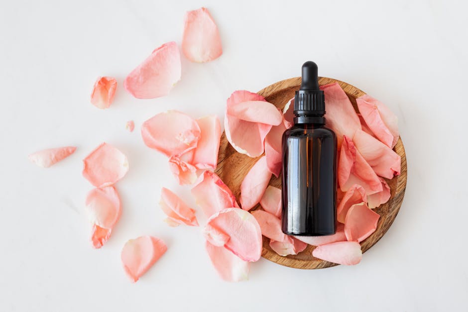
Red: Often linked to energy, power, and passion, red packaging might suggest a potent product that promises immediate results. We might think of powerful serums or acne medications wrapped in bold red.
-
Blue: Connected to tranquility and reliability, blue packaging might be found on products that promise soothing relief, such as sensitive skin creams or after-sun lotions. This color choice can stand as a pillar of trustworthiness.
-
Green: Represents health, renewal, and nature. This is commonly displayed on organic or natural skincare brands. Green packaging can reinforce a product’s commitment to natural ingredients, appealing to health-conscious consumers.
-
Purple: Often associated with luxury and creativity. Now, more brands are using purple to signify unique formulations, including advanced anti-aging or innovative technology-driven products.
-
White: Suggesting purity and simplicity, white is frequently chosen by brands that promise minimalist, effective results, usually focusing on a clean formulation that excludes harmful chemicals.
By understanding these associations, consumers can navigate the crowded market with more awareness. It’s essential for them to decipher whether a product's claims align with their personal needs and feelings towards its visual presentation.
The Impact on Consumer Choice and Perception
Packaging is the first impression consumers get of a product. If it’s visually appealing and harmonious, it can draw consumers in faster than an advertisement. Research indicates that consumers make subconscious judgments about products in mere milliseconds based solely on their packaging.
Take a moment to reflect on your personal experiences—how often have you picked up a skincare product simply because the color palette appealed to you? Various research studies confirm that over 90% of consumer judgments about products are based on color alone. The implication here is striking: brands can significantly influence consumer choices just by tweaking their packaging.
Additionally, as social media heightens visual marketing, the power of ‘Instagrammable’ packaging becomes even more vital, as color choices play a crucial role in lifestyle aesthetics popular among influencers. Brands aligning with current visual trends can enhance their appeal, almost guaranteeing heightened engagement.
Practical Insights for Brands

Understanding the psychological influence colors have can help brands optimize their skincare product packaging. With tools and insights drawn from color theory, brands can make more tactical decisions about their packaging designs. Here are a few takeaway strategies for skincare brands:
-
Align Colors with Product Purpose: Determine how color topology aligns with the intended product benefits. For instance, if a brand focuses on rejuvenation, employing youthful and bright colors could enhance engagement.
-
Conduct A/B Testing: Brands should consider testing different color schemes to analyze which performs better in attracting consumers and yielding higher sales.
-
Stay Current with Visual Trends: Eye-catching color schemes are often dictated by trends. Staying aware of recent color palettes gaining traction can help brands remain relevant and appealing.
-
Consistent Branding: Ensure a consistent application of color palettes across product lines to create a recognizable brand identity. This helps in cultivating customer loyalty.
-
Seek Consumer Feedback: Regularly engage with consumers to understand their perceptions concerning color choices and preferences. Ideally, brands should incorporate this feedback into future designs.
Brands can dynamically adapt their offerings by aligning visual cues with consumer expectations and emotional responses. This adds a layer of understanding that feeds directly back into improving product efficacy perceptions.
Consumer Empowerment through Awareness

Equipped with insights into how colors impact choices, consumers can become more astute in their skincare selections. Recognizing the psychology behind packaging can promote mindfulness concerning what products are marketed to them versus what their unique skincare needs actually entail.
For personal skincare routines, consider evaluating how the colors of products resonate with you. Are you drawn to bright colors that promise energetic outcomes, or do softer tones invoke a sense of calm and well-being? This self-awareness can aid in selecting products that align more closely with your individual values and skincare goals.
Additionally, for readers interested in understanding how the microbiome interacts with skincare choices, our article on the microbiome of beauty offers excellent insights.
The Future of Color Psychology in Beauty

As beauty standards continue to evolve, so will the role of color psychology. With advancements in technology, brands will incorporate dynamic color-changing packaging or augmented reality elements to engage consumers on deeper levels. Imagine a skincare product whose packaging shifts colors based on environmental factors or personal skin needs! This innovation could very well redefine the landscape of skincare marketing.
Moving forward, brands must remain aware of the implications of color psychology in their designs. Future research will likely focus on consumer emotional responses to color combinations and how they can affect overall outcomes in product efficacy—a terrain ripe for exploration both for brands and consumers alike.
Final Thoughts on Skincare & Color
Understanding how colors influence our perception of skincare packaging allows us to navigate the expansive industry landscape mindfully. Consumers can make knowledgeable choices, while brands can harness color psychology to enhance efficacy perceptions and foster deeper connections with consumers. As we continue to unravel the relationship between color and skincare, a more enriching experience awaits both consumers and producers.
By leveraging insights from color psychology, shoppers can revolutionize their beauty routines, supported by brands that resonate with their needs. For those eager to learn more about the broader context of skincare effects, check out our guide on the sound of beauty—it just might add another layer to your beauty regimen.