The Psychology of Color in Skincare Packaging: Unveil Your Beauty Choices
When it comes to skincare, the decision-making process often transcends mere product ingredients. The role of packaging in shaping consumer perceptions and choices is as crucial as the potions contained within. Understanding the psychology of color in skincare packaging can illuminate why some products fly off the shelves while others gather dust. Through strategic use of hue and design, brands can influence emotions and perceptions, enhancing their appeal. In this article, we delve into how vibrant design affects your perception of skincare products, influencing everything from your mood to your buying decisions.
The Color Connection: Understanding Color Psychology
Before we unravel the specifics of skincare packaging, it's essential to understand the fundamental principles of color psychology. Colors evoke emotions, influence perceptions, and can even alter our behaviors. Marketers and psychologists have long recognized the power of color in shaping customer engagement and loyalty.
For instance, blue is often associated with trust and calmness, making it a popular choice for brands that want to convey reliability. Green, on the other hand, evokes feelings of nature and tranquility, appealing to consumers seeking organic or eco-friendly products. Red can generate energy and excitement, perfect for products targeting younger demographics or those promising dramatic results.
The Subtle Influence of Skincare Packaging Colors
When you enter a beauty aisle, the array of colors can be overwhelming. Each hue is meticulously chosen to trigger specific emotional responses. This strategic use of colors in skincare packaging can significantly impact consumer choices. Studies indicate that consumers make a split-second judgement about a product based solely on color. Therefore, understanding this influence can lead to better marketing strategies and product design.
For skincare brands, utilizing the right colors can not only enhance visibility on the shelf but also boost engagement levels. A recent study published in the Journal of Consumer Research suggests that products with color schemes aligned with their marketed benefits (like calming blue for moisturizers) see a higher conversion rate compared to those with mismatched packaging.
Case Study: Leading Brands That Nail Their Colors
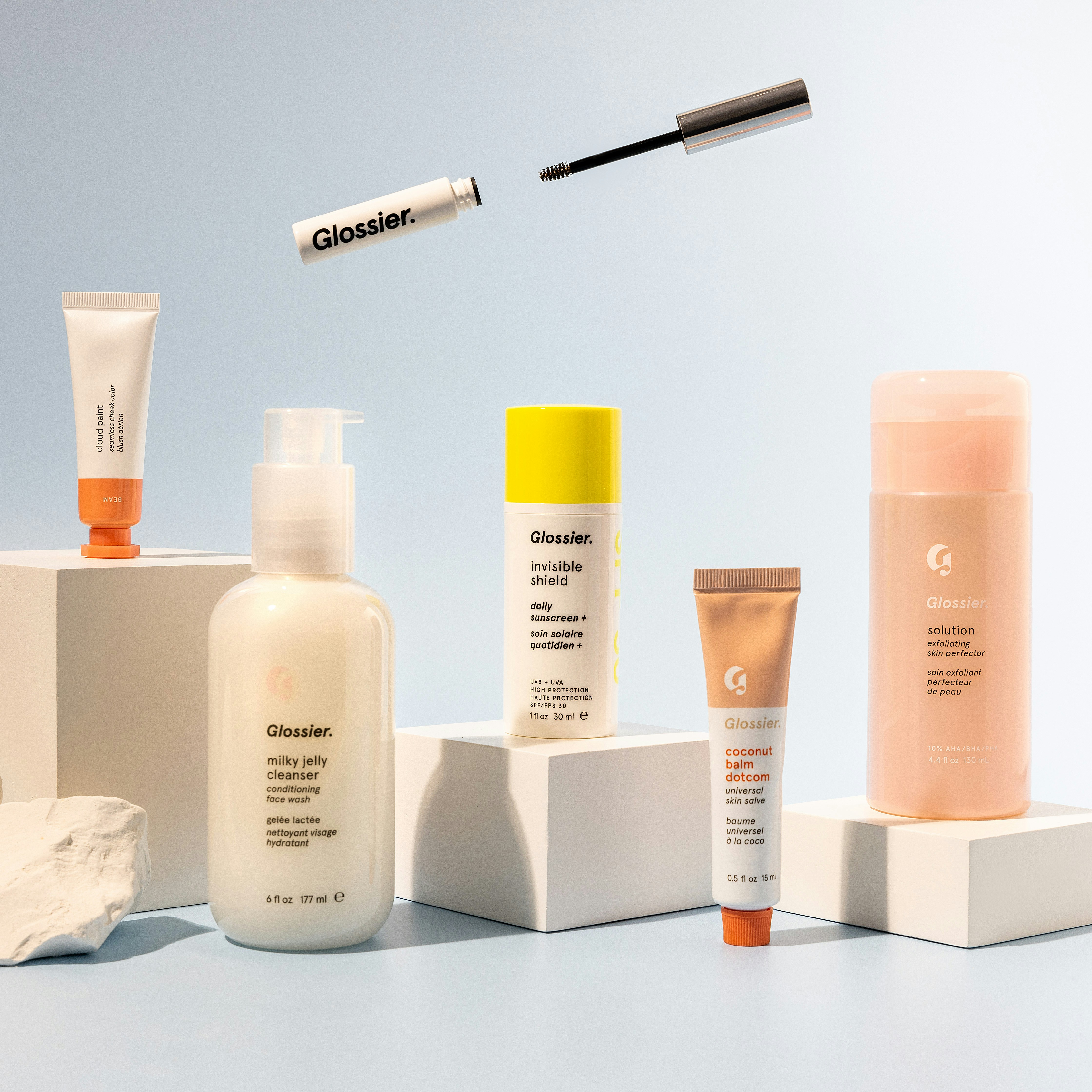
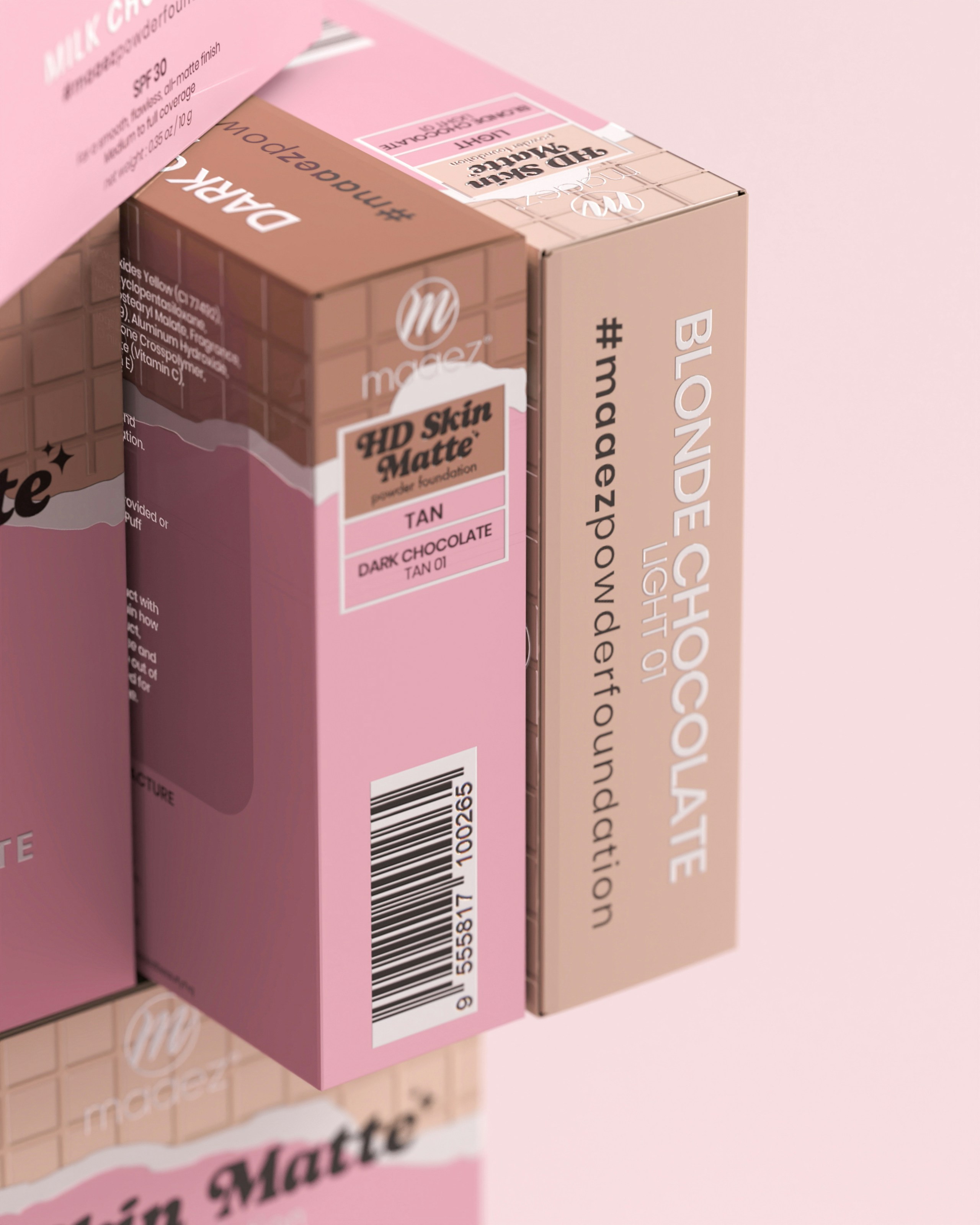
Take a moment to consider leading skincare brands and their color choices. The gentle pastels of Cetaphil, for example, convey a soft and reassuring message of care. In contrast, the vibrant and bold packaging of Sunday Riley communicates energy and innovation, appealing to a younger audience eager for groundbreaking products.
This category-wide analysis reveals a fascinating trend: brands that understand their target audience leverage color psychology in packaging to cater to what their customers associate with effectiveness. By analyzing these examples, we find common themes and patterns that can guide new entrants in the skincare market.
The Elements of Effective Skincare Packaging Design
Color Theory in Action

Color theory blends the emotional aspects of colors with functional design principles. Key factors such as contrast, balance, and harmony play pivotal roles in creating a visually appealing package.
-
Contrast: A well-contrasted design draws attention and enhances readability. For skincare products, this is particularly vital for information conveyed on the packaging, such as ingredient lists or usage instructions.
-
Balance: Symmetry creates an aesthetically pleasing image but be careful with too much uniformity; it can become dull. Skincare brands often use a blend of balanced designs with unexpected color pops to create intrigue.
-
Harmony: A cohesive look through harmonized colors ensures that all elements work together. This harmony also extends to the emotional message that the brand wants to convey.
Texture and Material as Complementary Elements

While color plays a significant role in consumer perception, texture and material also contribute to the overall impact of skincare packaging. A matte finish may impart a sense of luxury and sophistication, while a glossy finish can evoke a feeling of freshness and vibrancy. These tactile responses are just as important as visual cues, as they enhance the overall experience of the product.
Incorporating eco-friendly materials can also boost brand perception since consumers increasingly favor brands that align with sustainable practices. Reports by the Sustainable Packaging Coalition indicate that consumers are willing to pay more for sustainably packaged products, making eco-conscious design a powerful choice.
Seventh Sense: The Role of Scent
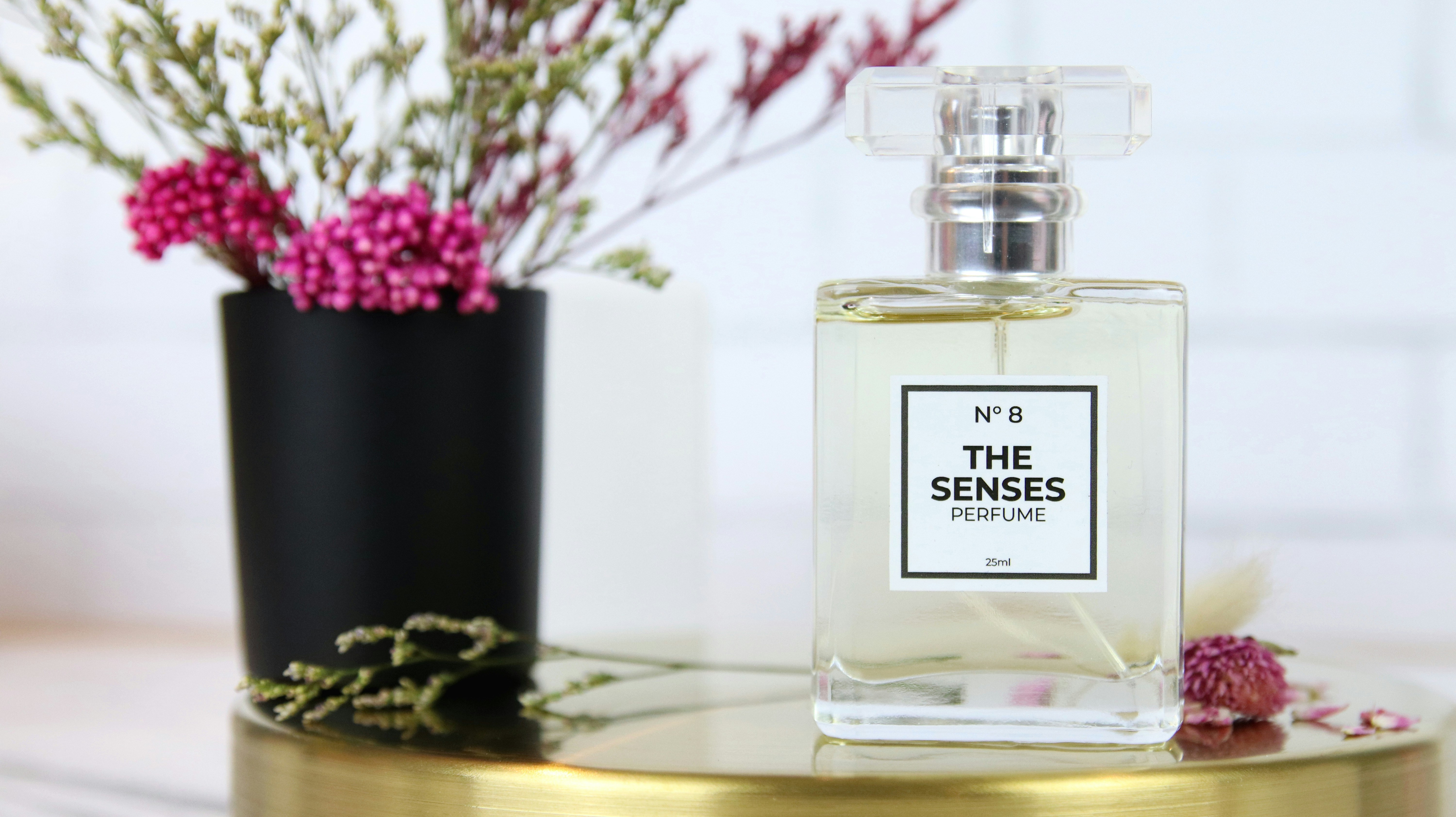
While we focus on color, we shouldn't overlook the olfactory appeal of skincare products. The fragrance can further enhance the impact of packaging. Imagine vividly colored packaging adorned with scents like lavender or citrus—this combination not only pleases the eyes but can also create an emotive experience that reinforces the product's benefits.
The interplay between packaging color, scent, and texture acts like a symphony, ultimately leading to a more profound consumer connection. Aesthetic appeal becomes experiential, enhancing the overall perception of product efficacy.
Insights from Industry Experts
To truly grasp the nuances of color psychology in skincare packaging, let's refer to some insights from industry experts.
Dr. Sarah Thompson, a renowned psychologist in consumer behavior, elaborates, "Colors can change the way we interpret a product's effectiveness before we even use it. Brands that get this right not only attract initial attention but also foster trust and emotional ties."
Alice Ramirez, a skincare entrepreneur, shares her own experience. “When we launched our line, we conducted surveys focusing on color preferences. We noticed that our target market reacted positively to green and cream. This led to a redesign of our packaging, and it increased our sales by over 30% in the initial quarter!"
These expert views emphasize the importance of aligning psychological principles with practical design strategies in the skincare market.
Beyond Color: The Future of Skincare Packaging

As consumer awareness evolves, so too must skincare packaging. Brands are beginning to delve into experiential packaging that not only captivates the eye but also engages other senses.
Interactive Packaging Innovation

With advancements in technology, brands are exploring interactive packaging solutions. Imagine a skincare product that changes color based on your skin's pH levels, or one that incorporates augmented reality to provide a virtual demonstration of how the product works. This would revolutionize consumer experience and engagement.
Sustainability as a Vital Element

Sustainability is becoming an increasingly significant factor influencing consumer choices. Brands are acknowledging that their packaging must align with broader environmental values. The shift towards biodegradable materials, minimalistic designs, and refillable containers resonates with today’s environmentally conscious consumers. In doing so, companies can boost brand loyalty and enhance their authority within the industry.
Embracing Brand Identity Through Packaging
Skincare brands often go beyond color to establish a unique identity through packaging that tells a story. For example, if a brand focuses on artisanal ingredients, their packaging might reflect a handcrafted aesthetic, inviting consumers to feel connected to the product.
Culture and Context
Different cultures respond to colors in various ways. In many Western cultures, white is seen as a symbol of purity, while in some Eastern cultures, red signifies good luck. Brands entering international markets must navigate these perceptions carefully. Experts suggest that conducting market research tailored to cultural specifications can significantly enhance branding strategies.
Final Thoughts: Prioritizing the Visual Narrative in Skincare
As you select your next skincare product, take a moment to appreciate the packaging. What emotions does it evoke? Does the color resonate with your values and desires? In the vast world of skincare, understanding the psychology behind color choice can help you make more informed purchasing decisions.
Skincare is more than a simple routine; it's an emotional journey shaped by perceptions, preferences, and desires. Becoming aware of the psychological aspects behind skincare packaging can empower consumers and elevate personal beauty rituals.
For those aspiring to launch their skincare lines, remember that diving deep into color psychology, sustainability, and experiential design can set your brand apart in this competitive landscape. As you harness the art of color in packaging, consider how your choices can enhance customer experience, trust, and ultimately, loyalty.
So the next time you reach for a skincare product, let the colors, textures, and scents guide you in this olfactory and visual adventure to beauty—each product is not just a skincare solution, but a thoughtful interplay of psychology and design waiting to enhance your daily routine.
For further in-depth insights on innovative skincare practices, check out our blogs on ancient beauty rituals and the psychology of scent.